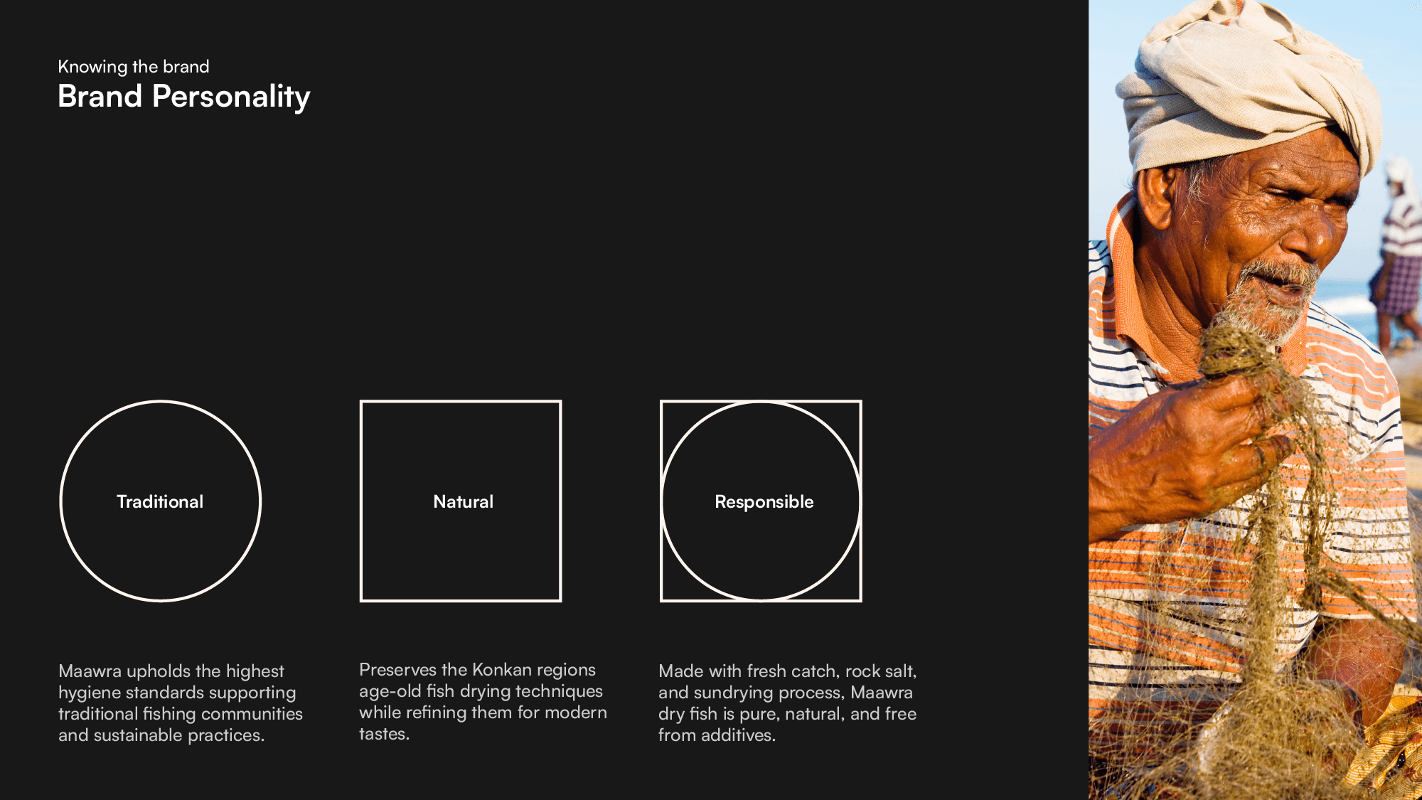
Brand Story
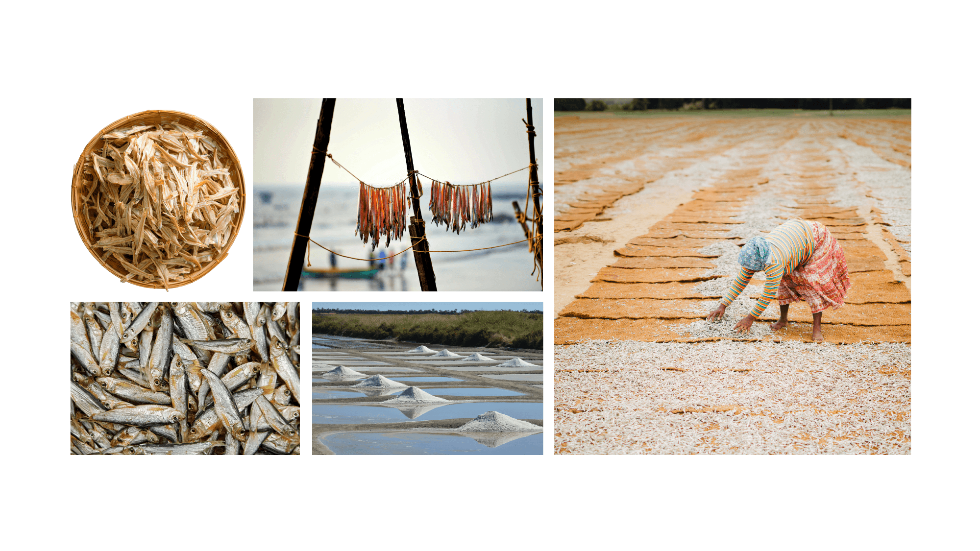
Maawra is deeply rooted in the western coastline of India, especially the Konkan region, where the art of fish drying has been passed down through generations. Dry fish is more than just food—it’s a tradition, a livelihood, and an essential part of Indian and global cuisines.
Despite its rich heritage and nutritional benefits, high-quality dry fish that retains its authentic taste and purity can be hard to find. That’s where we come in. Maawra bridges the gap between tradition and modern preferences by perfecting the time-honored drying process while ensuring every batch is carefully handled to maintain its natural goodness.
The process begins with fresh fish caught in large quantities, then mixed with locally produced rock salt to enhance its preservation naturally. It is then carefully sun-dried, a method that allows it to retain its rich flavor and nutritional value while ensuring it lasts for months without refrigeration. However, traditional drying methods are often seen as unhygienic, raising concerns among modern consumers.
By staying true to the wisdom of the past and refining our process for today’s consumers, we bring you dry fish that is pure, flavorful, and packed with nutrition—just the way it was meant to be.
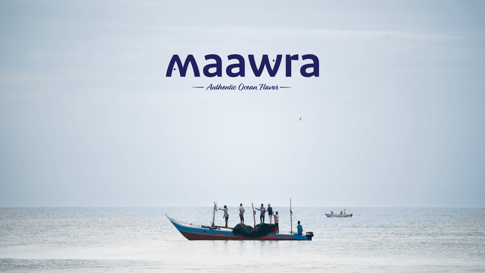
Logo Concept Explanation:
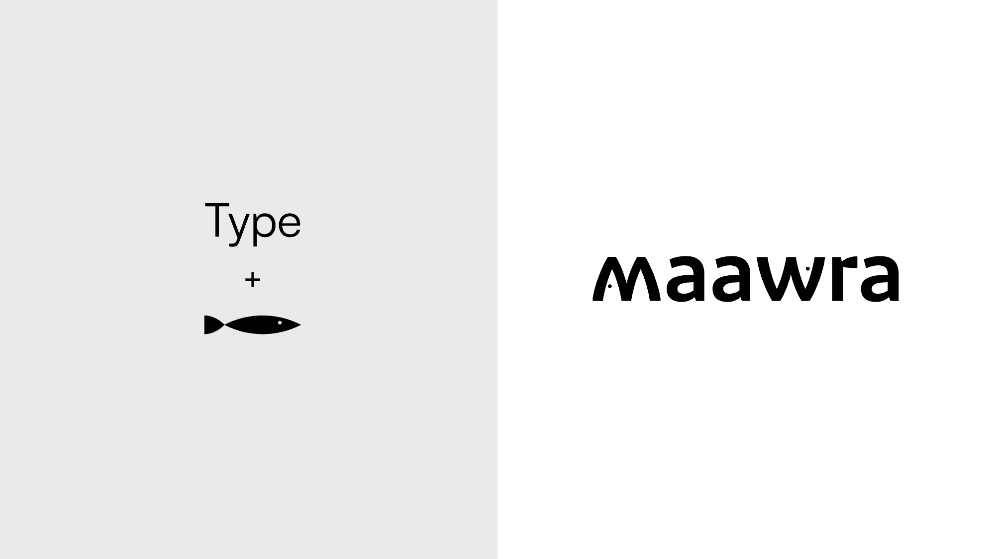
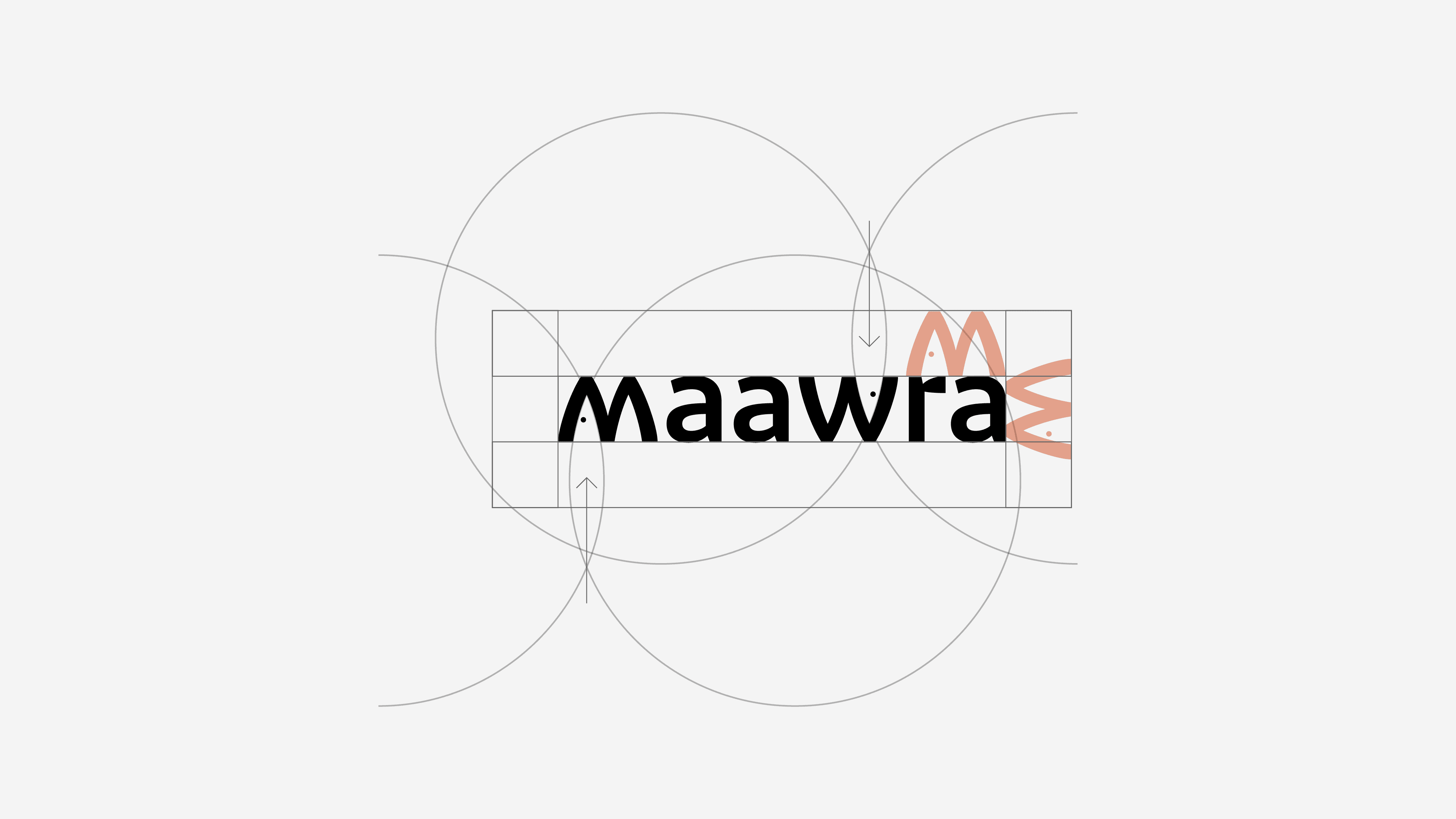
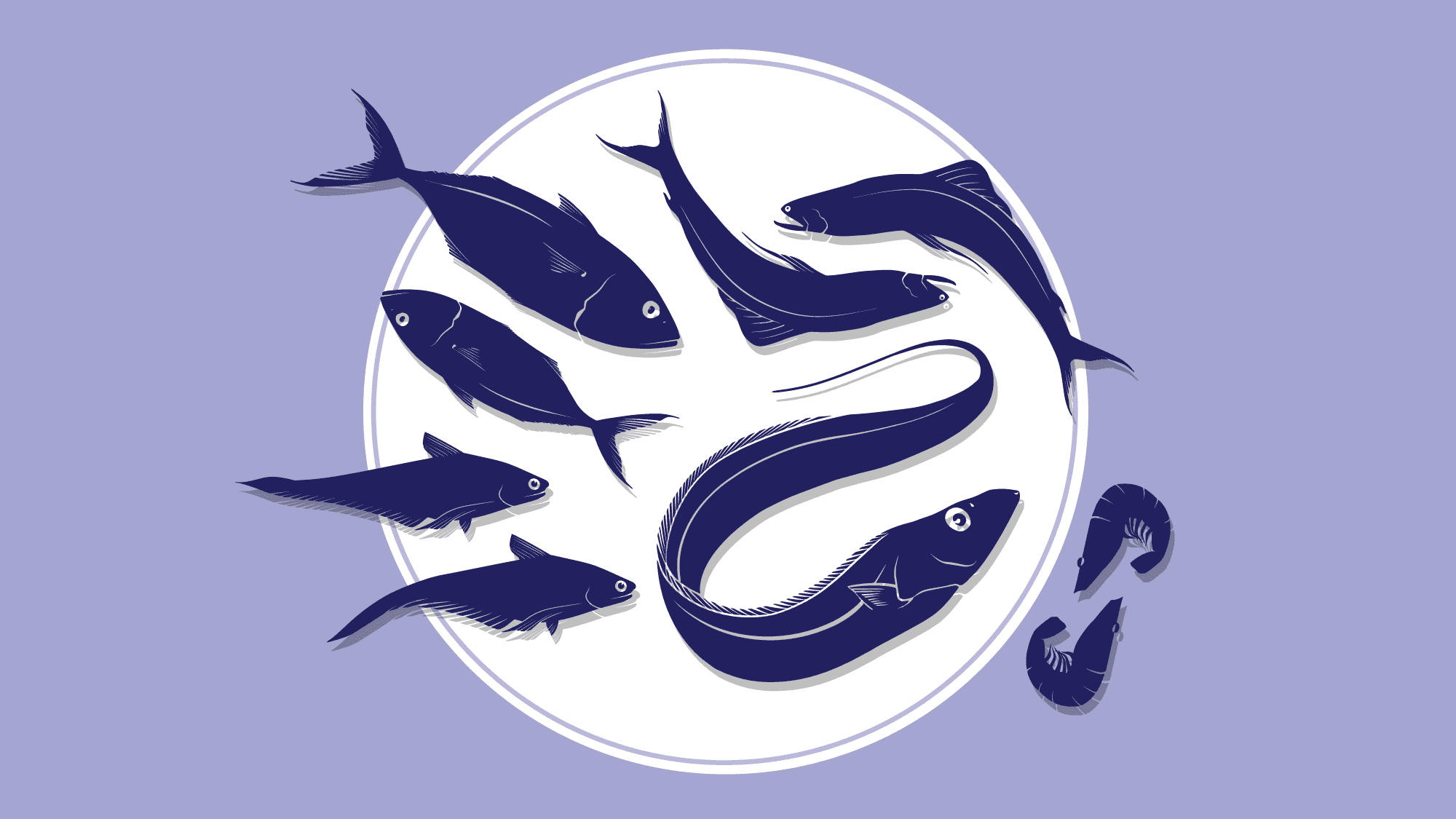
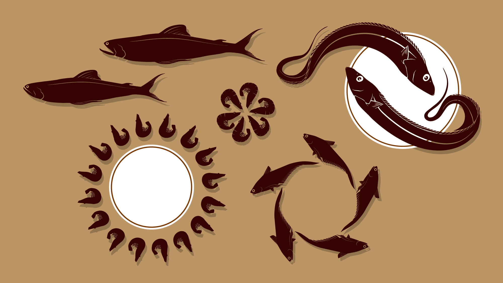
• The design takes inspiration from fish, a central element of your brand, and incorporates it into the wordmark.
• The first ‘M’ is stylized to resemble the natural curve of a fish, making the logo dynamic while staying minimalist.
• The letterforms remain clean and modern, ensuring readability while the fish-like integration adds a unique touch.
• This fusion of type and symbolism effectively communicates your brand’s connection to seafood and the
traditional craft of dried fish.
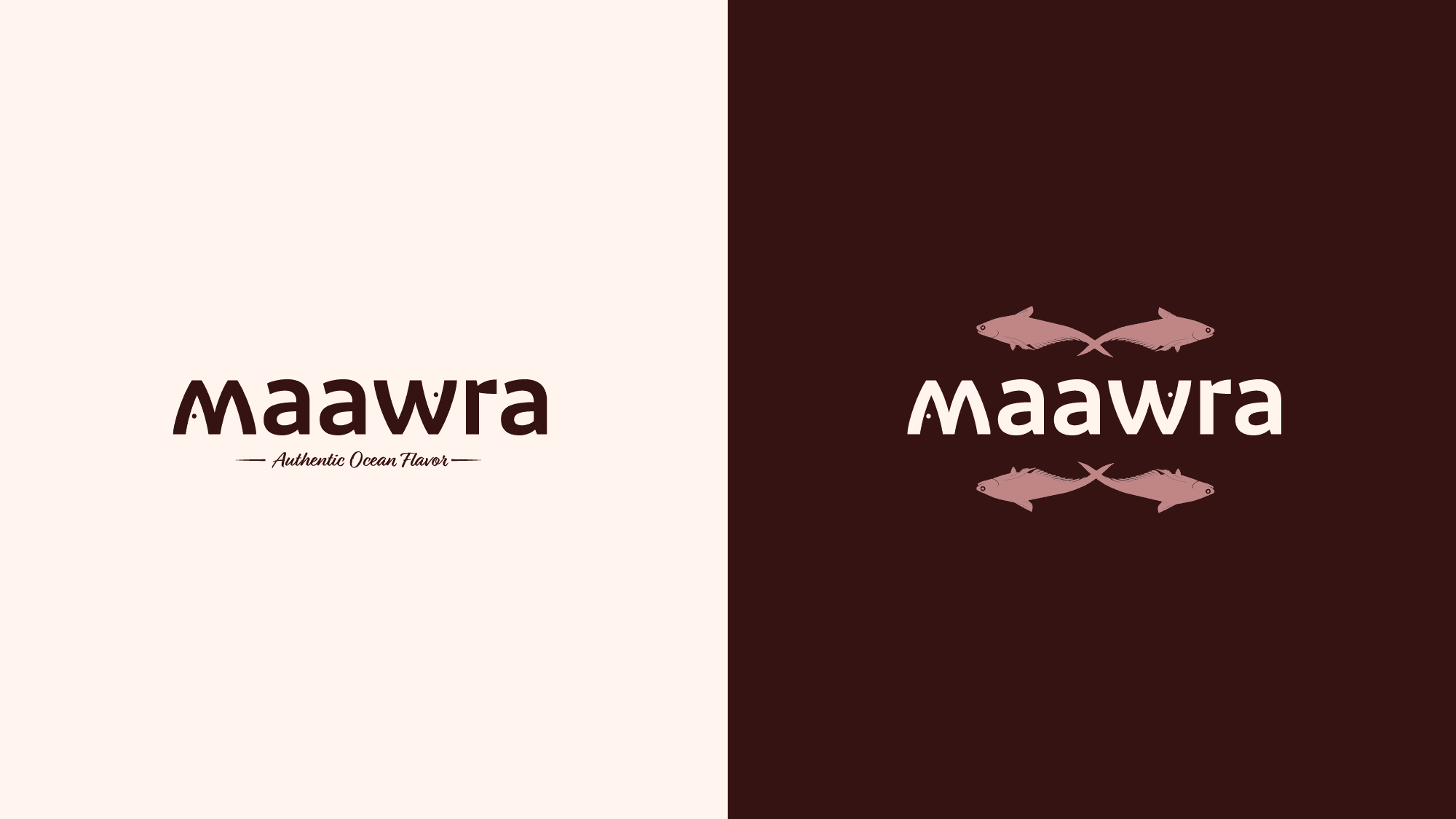
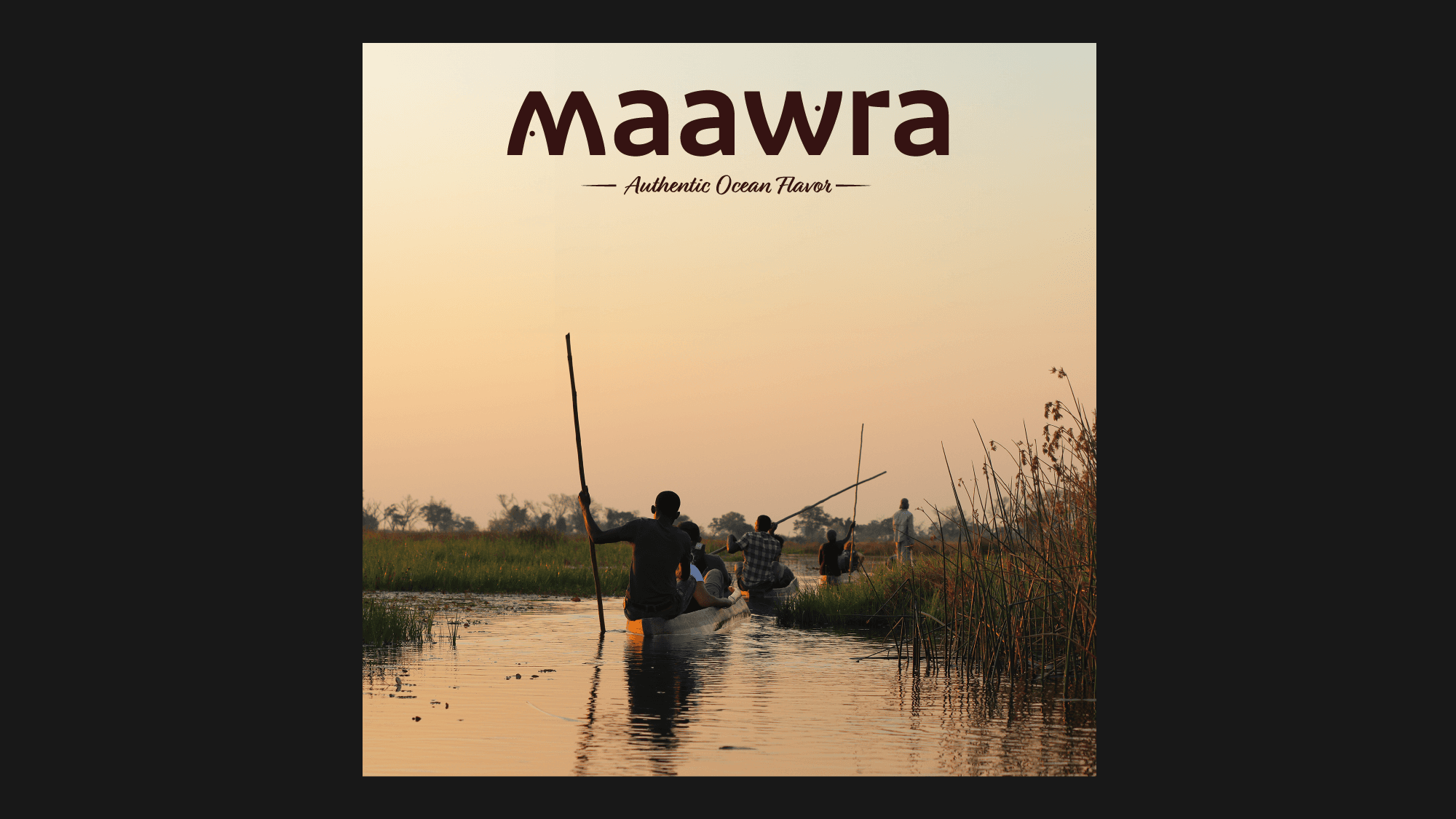
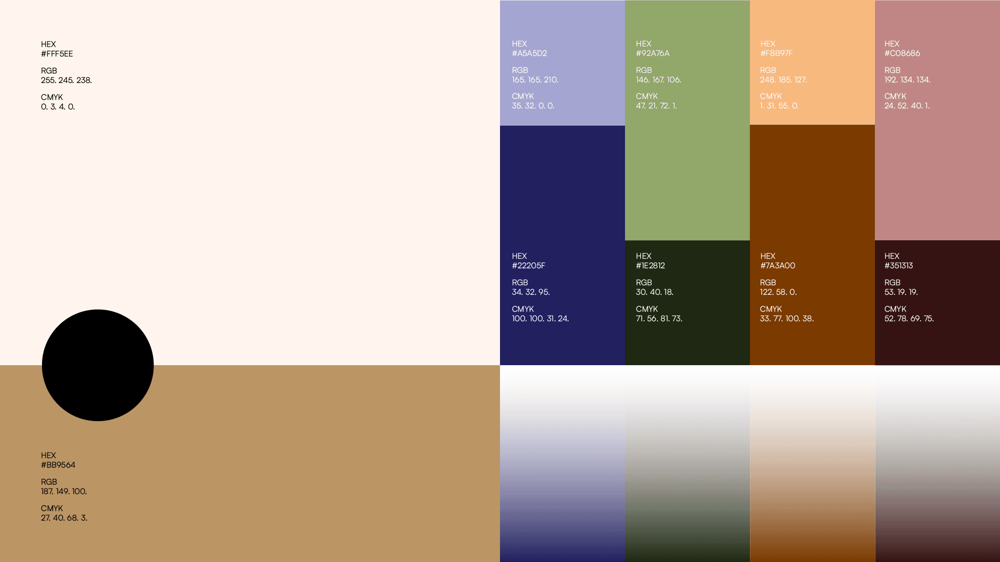
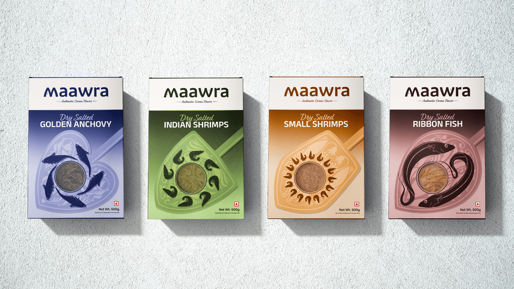
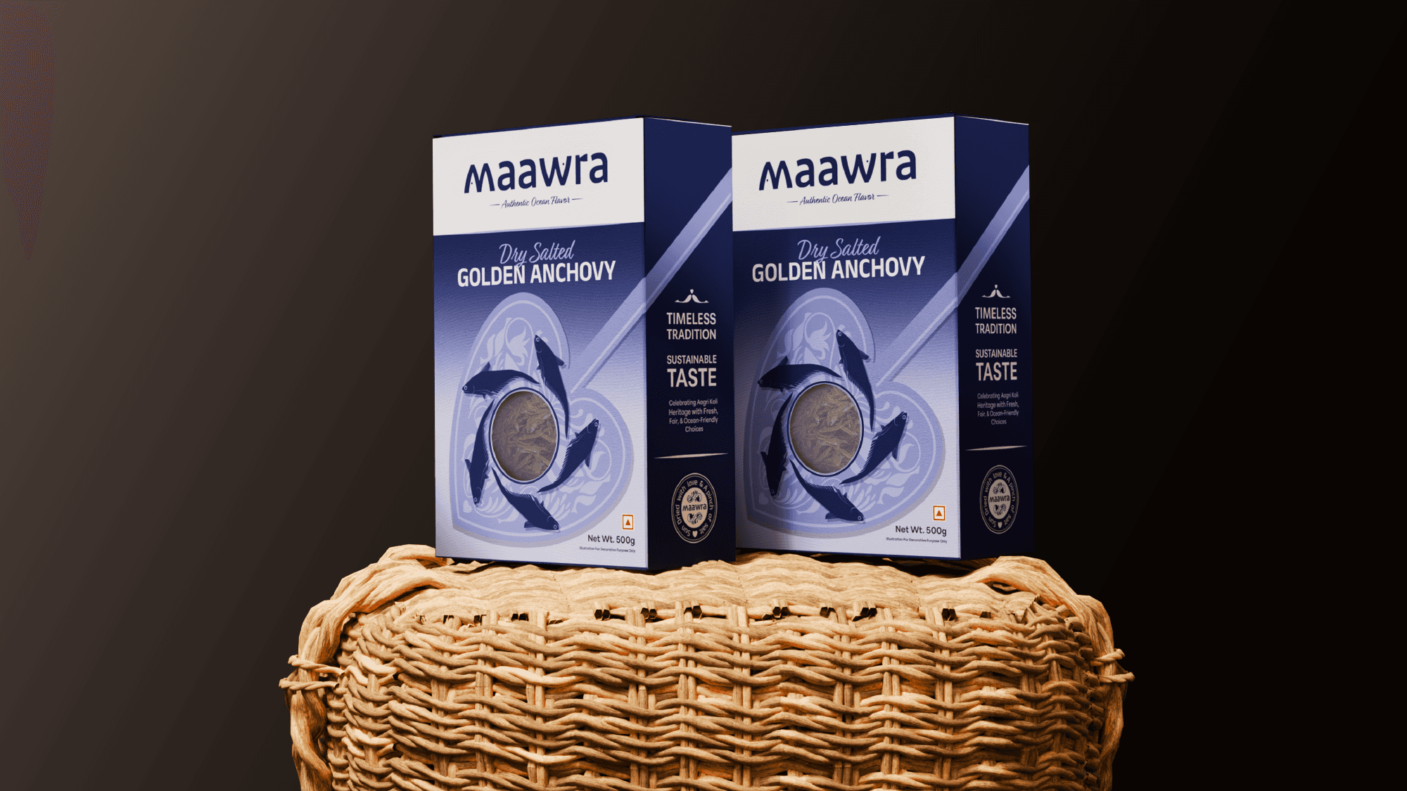
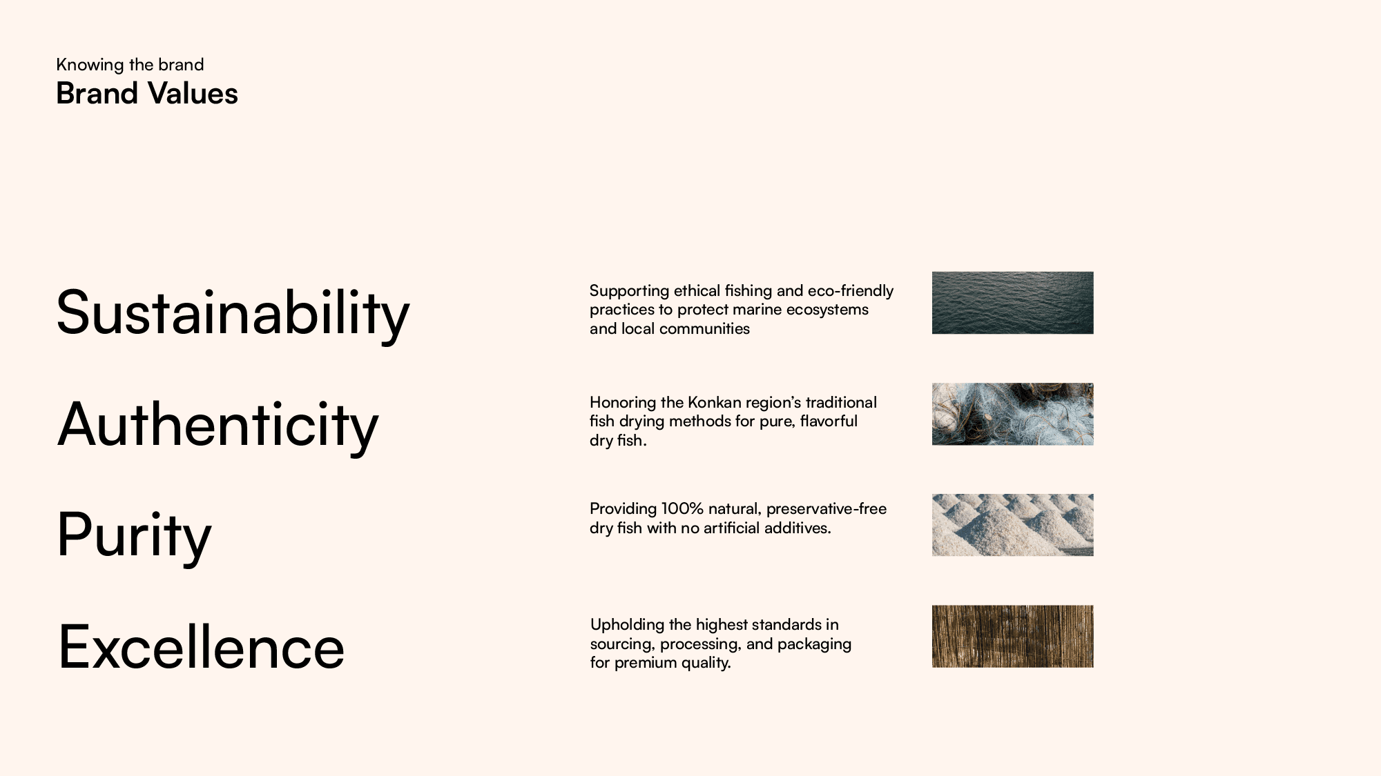
Earth & Ocean Palette
Inspired by the coast, blending nature, heritage, and warmth.
Deep Blue – Trust, depth, and timeless wisdom.
Olive Green – Harmony, sustainability, and coastal landscapes.
Warm Brown & Terracotta – Heritage, resilience, and authenticity.
Muted Peach & Neutrals – Balance, warmth, and approachability.
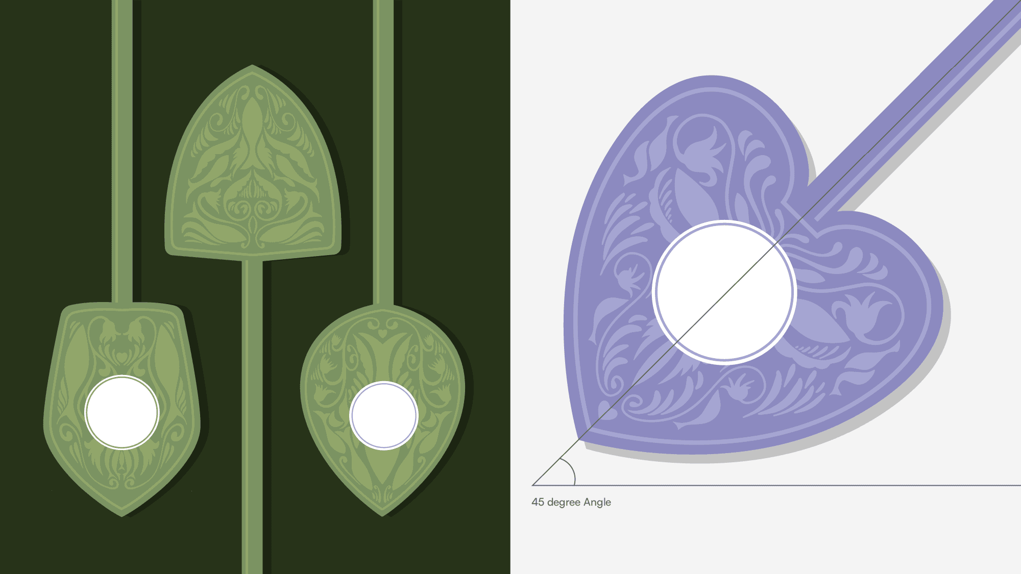
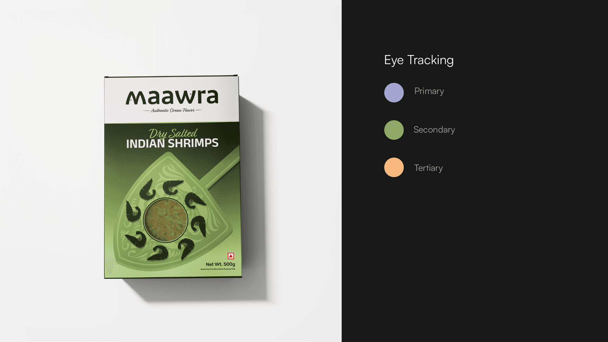
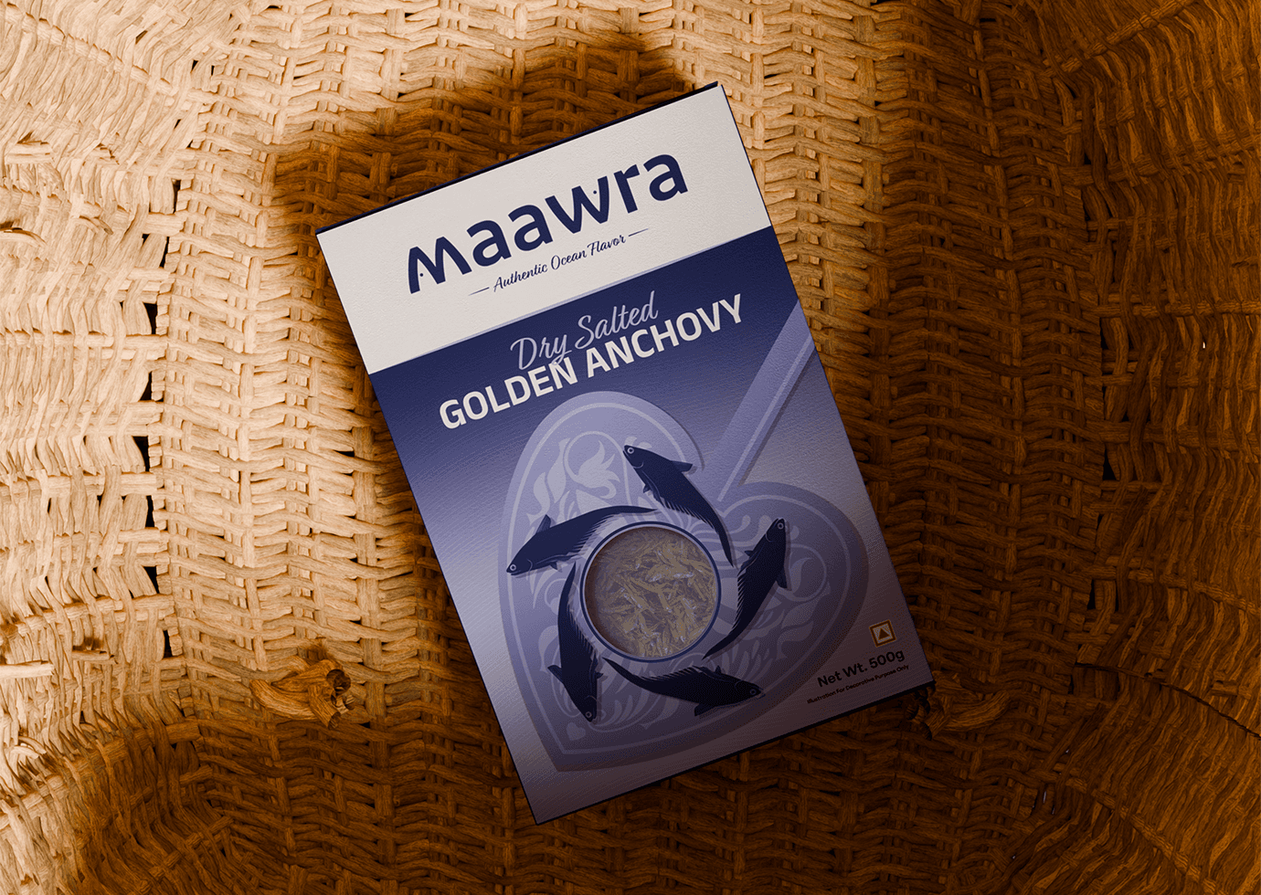
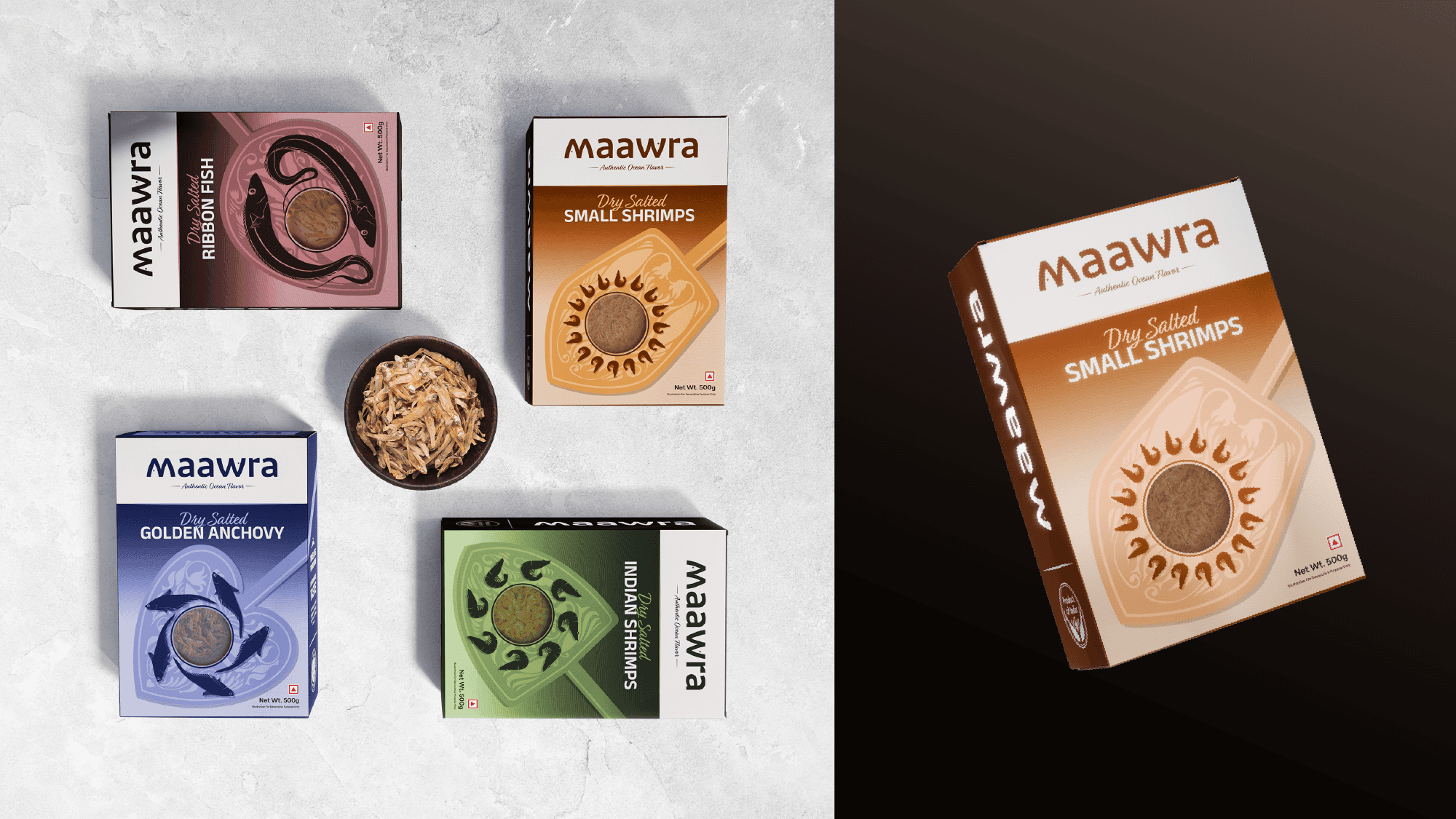
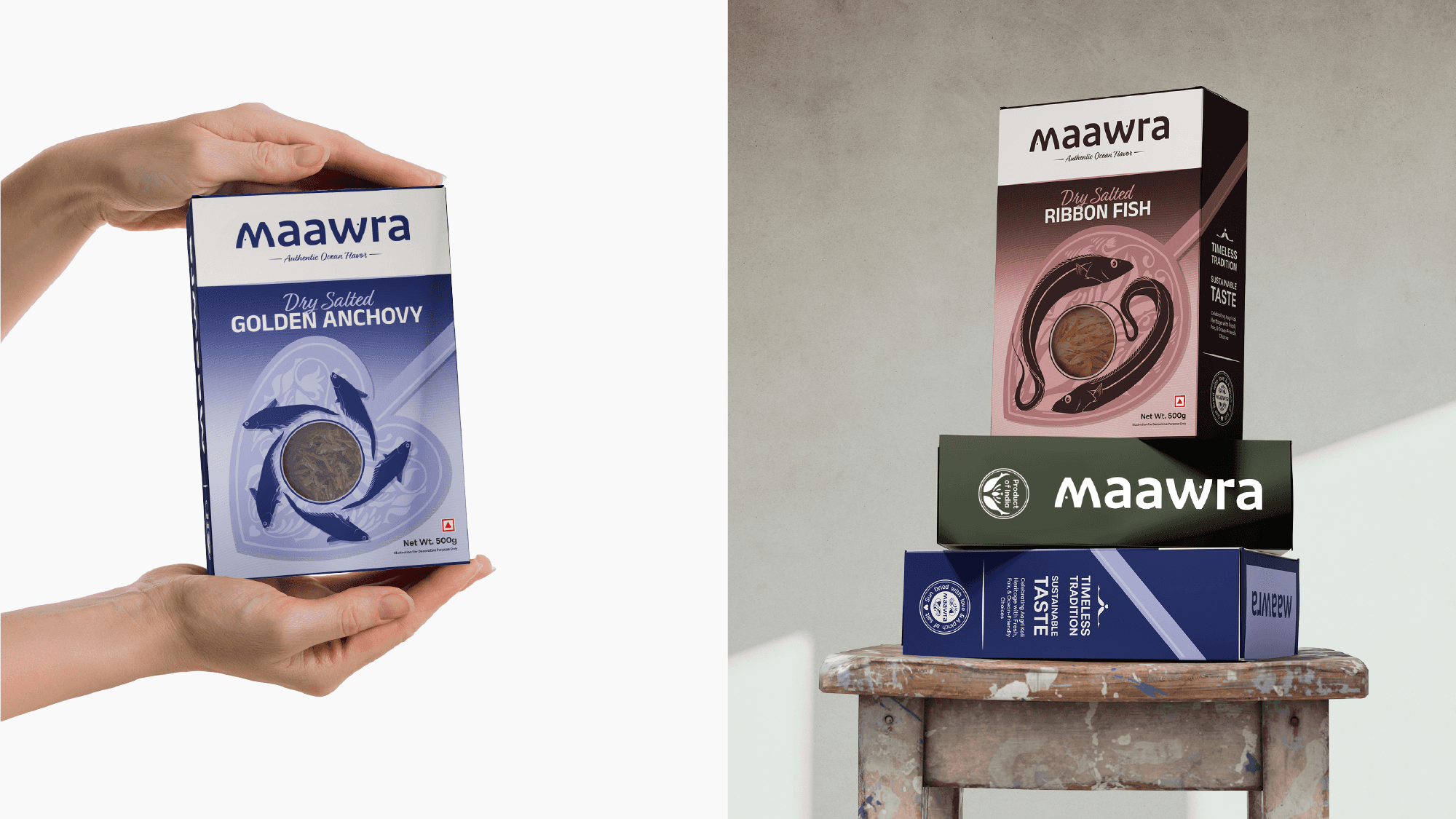
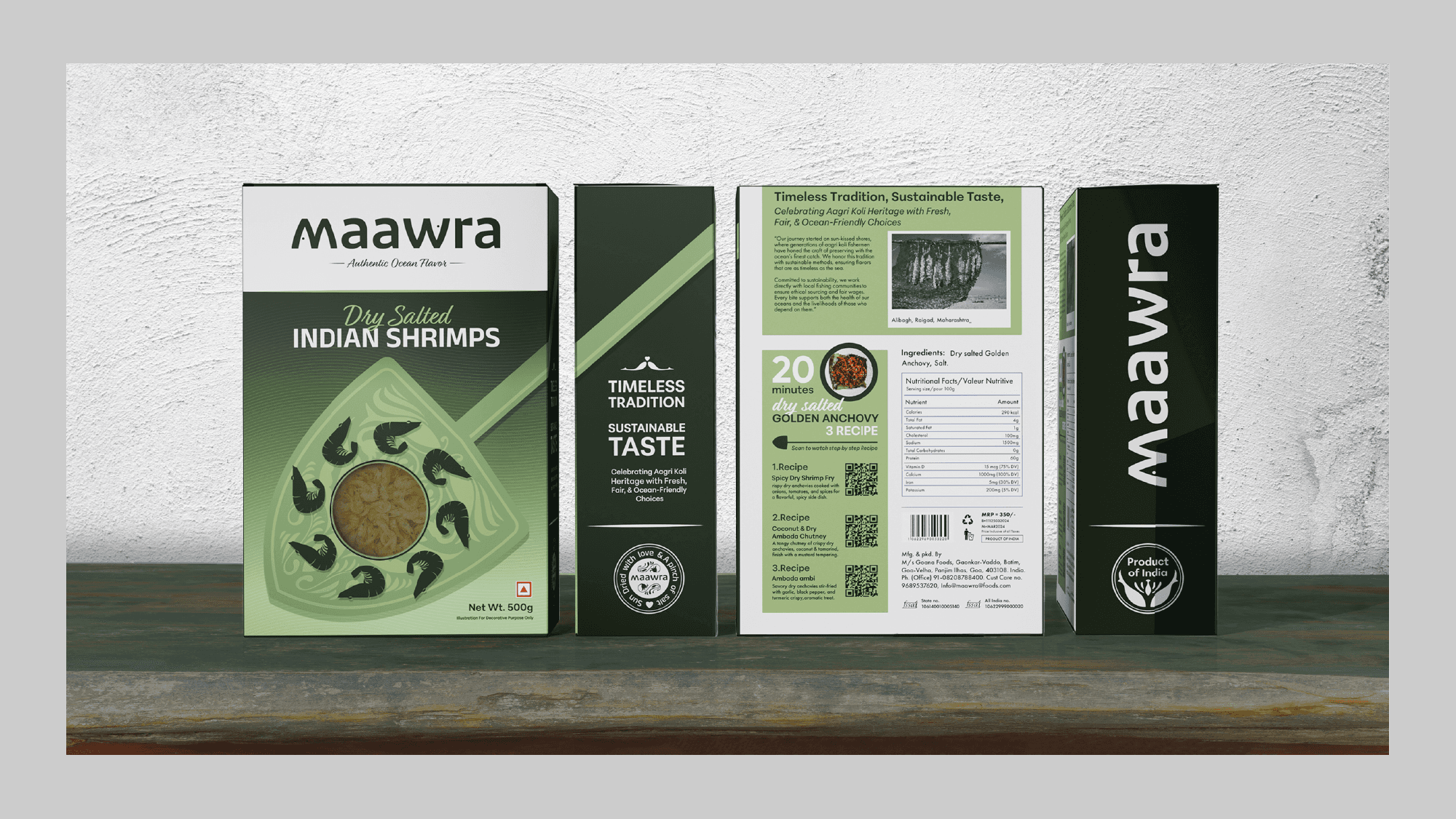
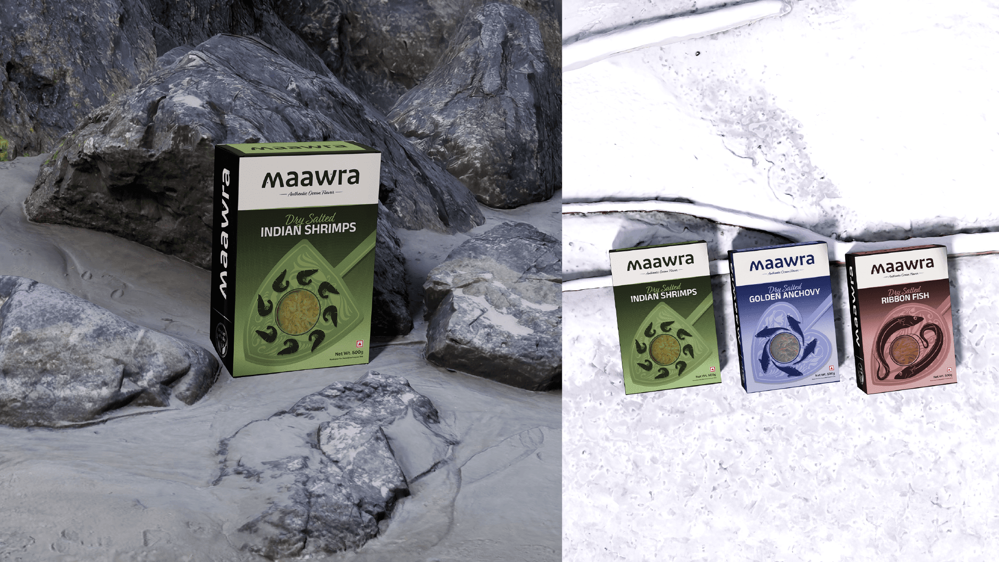
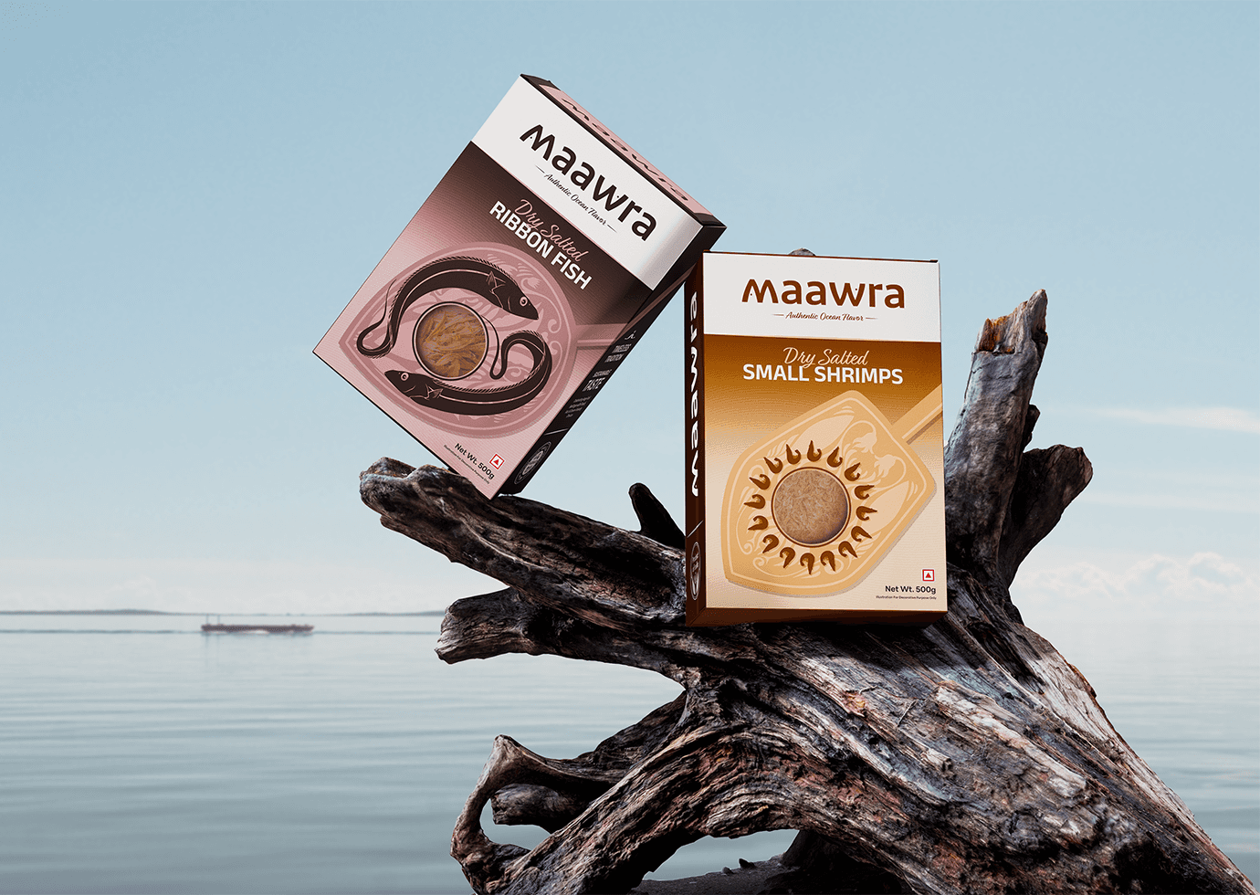
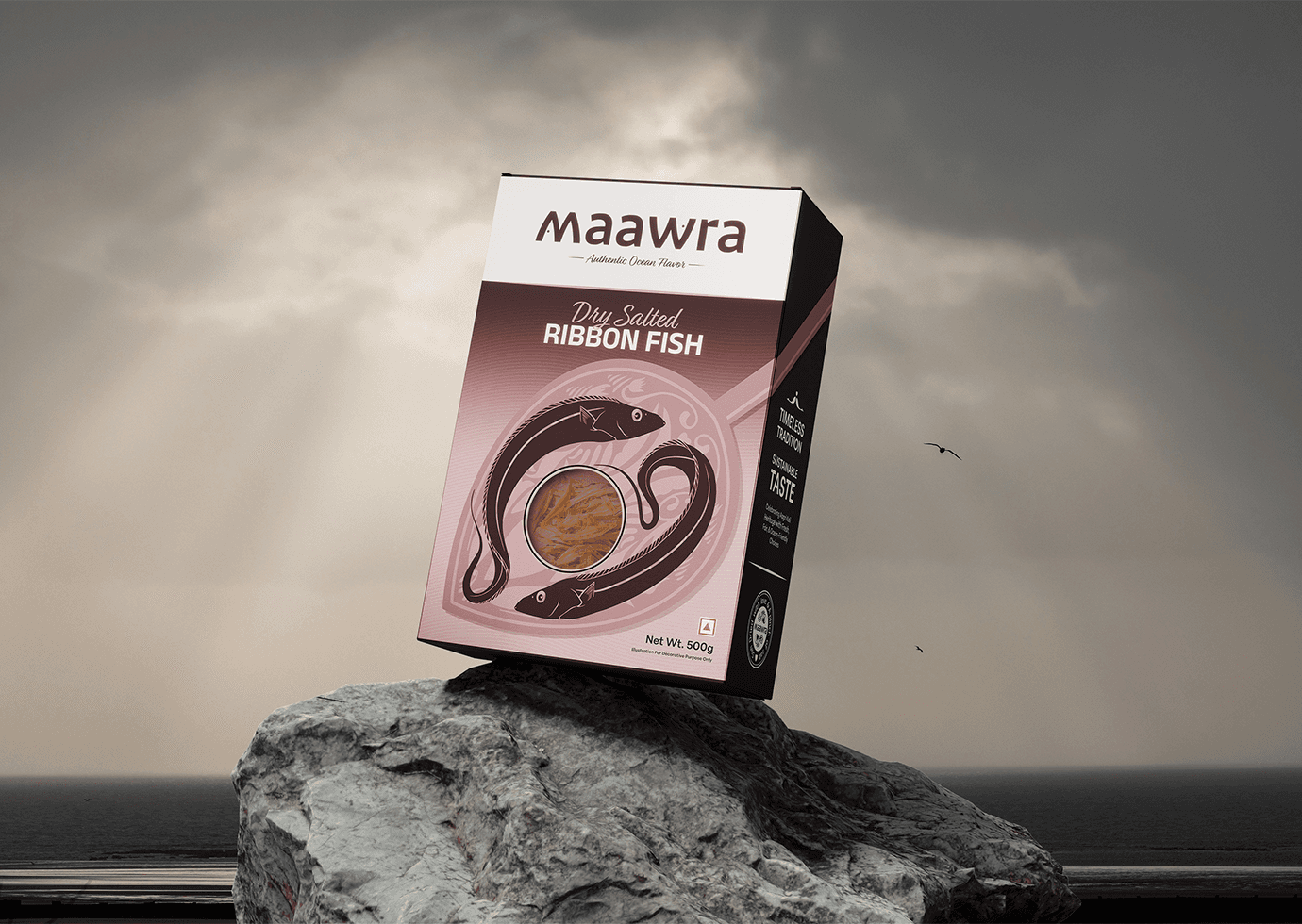
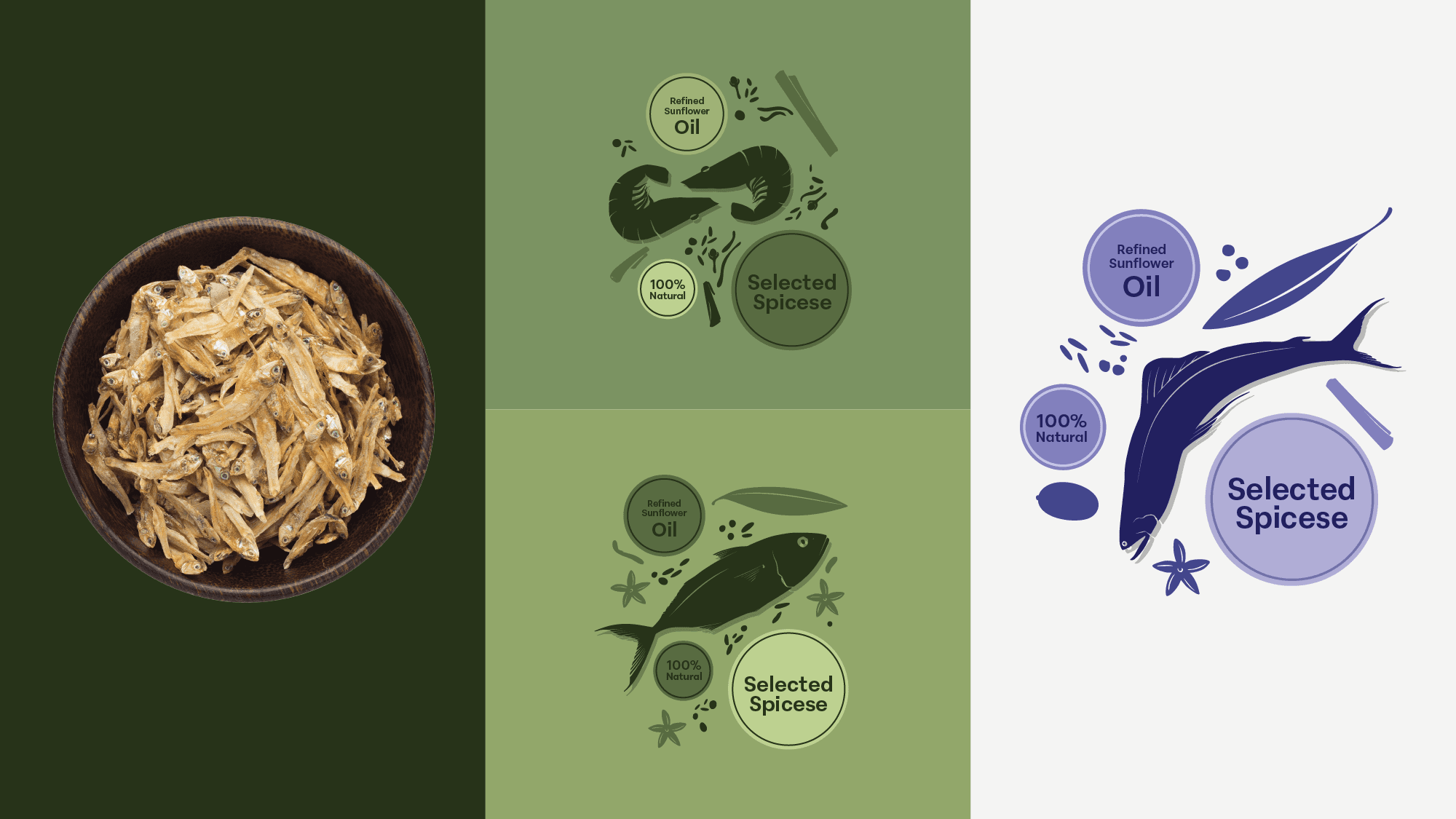
One of the key challenges in designing the visual identity for this dry fish brand was the inherent appearance of the product itself. Dry fish, by nature, lacks visual appeal and does not resemble its fresh counterpart, making it difficult for new or unfamiliar consumers to recognize or relate to it. Using direct imagery of dry fish could feel uninviting, especially for those trying it for the first time. Additionally, many consumers may not be familiar with the specific type of fish once dried, leading to confusion when identifying the product through photographs alone.
To address these challenges, I opted for a stencil-style illustration paired with a see-through window on the packaging. This approach strikes a balance between artistic representation and product visibility. The illustration provides a clean, visually appealing depiction of the fish while the transparent window ensures authenticity, allowing consumers to see the product without overwhelming them with unfamiliar imagery.
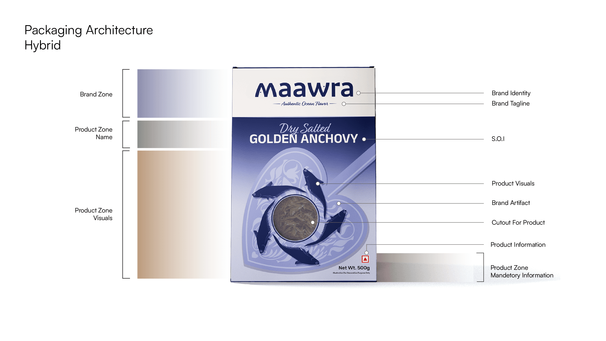
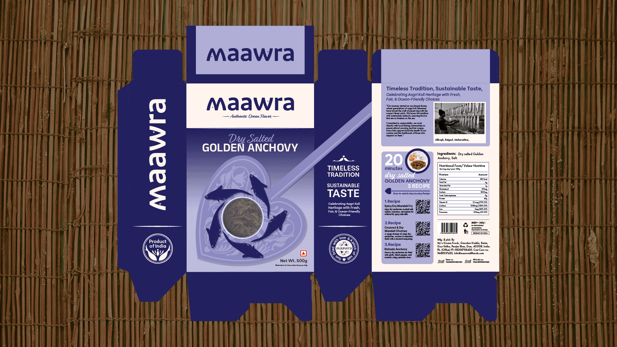
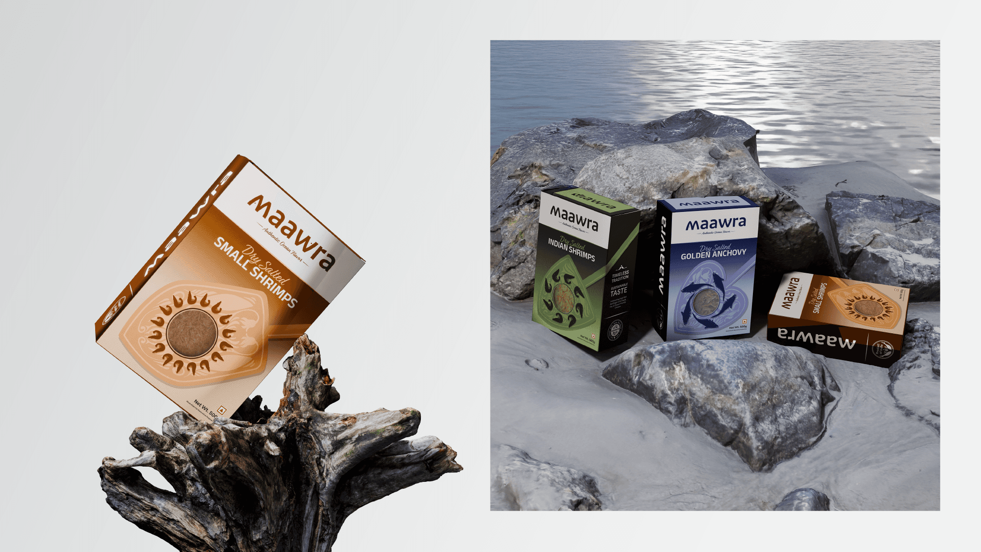
Packaging Architecture Breakdown
Brand Zone – Showcases brand identity and tagline for strong recall and a premium look.
Product Zone – Clearly defines the product with a Statement of Identity (SOI).
Visual Zone – Engages customers with: Product visuals for appetite appeal ,
Cutout window for transparency, Product info like weight, benefits, and certifications
*This structured approach ensures clarity, authenticity, and engagement.